
Random RIA Review: Great Oak Capital Partners
A real-world marketing teardown with advisor-ready takeaways.

A website is an extension of your team. Almost like another advisor, but with a 24/7 job. It’s marketing your services, establishing your authority, educating clients, and facilitating prospect engagement.
Except RIA websites are usually…bland.
Stuffy.
Jargon-riddled.
And, in turn, off-putting from a user’s perspective.
That’s why I’ve started a new series: Random RIA Reviews. Each month, I’ll pick a random RIA and review their site and content through a marketing lens, highlighting what’s working, what could be stronger, and what you can take away for your own digital marketing efforts.
Up first: Great Oak Capital Partners, out of South Easton, Massachusetts. (Yes, this is completely random. I used a random state and city generator and started blindly scrolling through search engine results.)
Let’s dive in.
P.S. Don’t forget to subscribe:
Firm Background: Great Oak Capital
Offices: 2 (Massachusetts and Florida)
Team Size: 6
AUM: ~$390M
Clients: 562
Client Types: Predominantly individuals, but also a few pension and profit sharing plans
Initial Impressions
People form opinions in seconds, if not instantaneously. So a home page carries the onerous responsibility of making a lasting first impression.
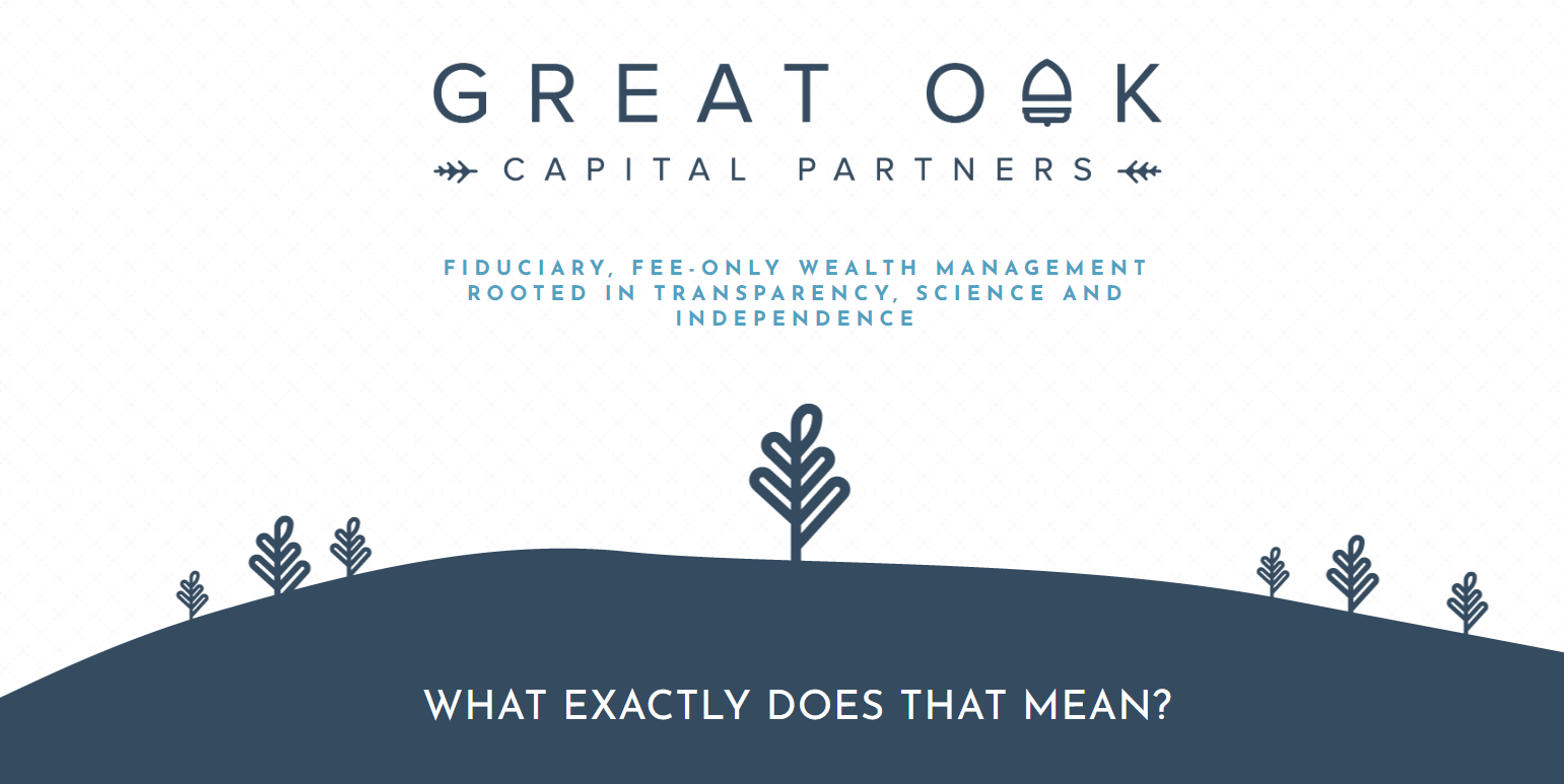
Great Oak’s homepage is succinct. Its sole purpose is defining what it does (fiduciary, fee-only wealth management) and what that means.
It’s a clean, no-nonsense approach.
Area to Improve: What Now?
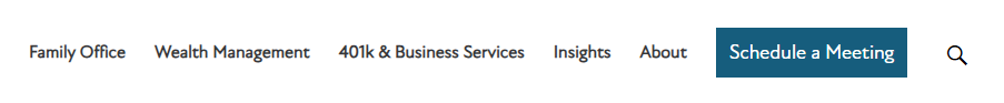
From a UX perspective, the homepage (and the site as a whole) is missing CTAs that drive visitors through the journey — either to book a meeting or learn more about the firm and its services.
You can see this in the hero above and the screenshot below. Great Oak breaks down what fiduciary fee-only wealth management is, but there’s no next step in the sequence. We hit the end of the page. Which leaves me wondering, what now?
I’d like to see buttons added to drive to other pages, like the planning process, team, and/or contact pages.
One admittedly nitpicky ding: they use en dashes, not em dashes. En dashes are for numerical ranges (e.g., 5–10 or 1990–1999).
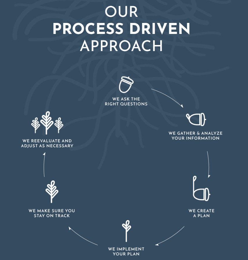
Strength: Clever Logo and Graphics
Great Oak has a minimalist theme, with the right touch of creative visuals (e.g., their logo, the below process cycle) and zero stock photography. *applause*
Granted, outside of their team page, they also don’t have pictures of any people period — which is something you generally should include to humanize your branding. But still, they make it work.
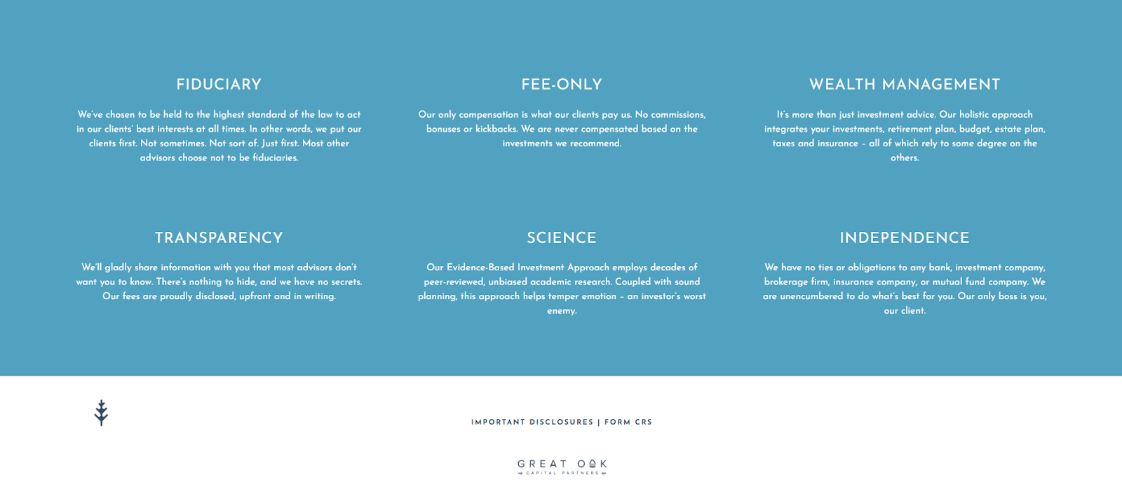
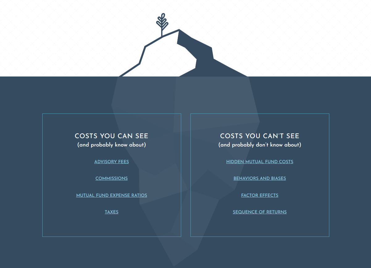
Strength: Fee Transparency and Education
I’ve seen firms explain the difference between fee-only and fee-based. I’ve seen fiduciaries explain the downsides of commission-based firms, and I’ve seen plenty of content on the hidden costs of investment management, such as tax drag, turnover, sequence of returns risk, and even biases/poor decisions.
But I haven’t seen a firm consolidate all of these onto one page that’s dedicated to the cost of advisory services. For any prospect that’s hesitant about the value of fees for services rendered (which is the majority of prospects), this is a strong page that positions the firm well.
Even though it’s long, it’s still organized clearly and has a sidebar with jumplinks. And, again, great graphic design choice.
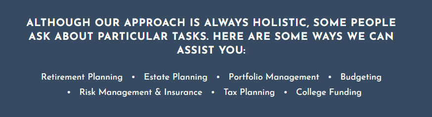
Area to Improve: Don’t Just Tell, Show Holistic Services
While their Planning Process page states that their approach is holistic (i.e., integrates investments, estate planning, budgeting, insurance, and taxes), there’s room to expand on this with more depth or concrete examples.
Most of the copy highlights aspects of investments, but not much on these other facets of wealth. A prospect may unconsciously decouple the idea of “holistic” wealth management from their services since there aren’t any specifics here.
We see this again on the FAQs page (image below). One approach would be to dedicate individual child pages that would live underneath the Planning Process or a new “Our Services” parent page. Another would be to simply expand on these services on the existing page.
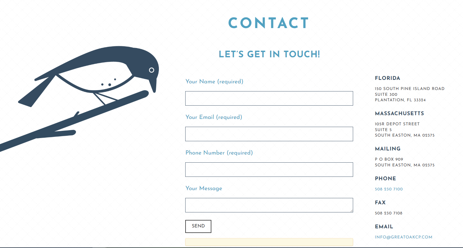
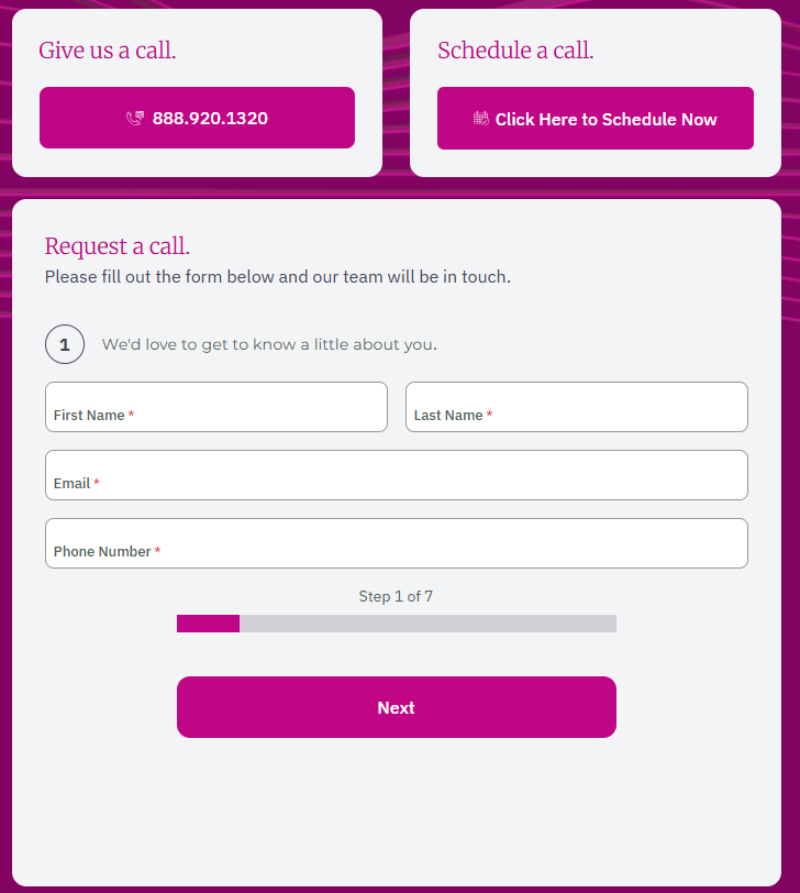
Area to Improve: Generic Contact Page
Not that it needs to be truly one of a kind. But this feels like the standard, templated contact page that we’d find on any type of site (personal or commercial). I appreciate when firms have built-in Calendly interfaces for scheduling meetings, as well as some context as to what clients can expect (e.g., a complimentary 30-minute meeting, easygoing conversation, no strings attached).
Looking at two of the larger RIAs, Creative Planning and Mercer Advisors, we can see that they prioritize this all-important step in the prospect’s journey. (Even so, both could do better jobs of explaining what to expect, or “what’s in it for me?”)
Creative Planning Menu Navigation (Schedule a Meeting)
Mercer Advisors Contact Page
Content
Last but certainly not least, the firm’s blog page, which is titled “Learn.”
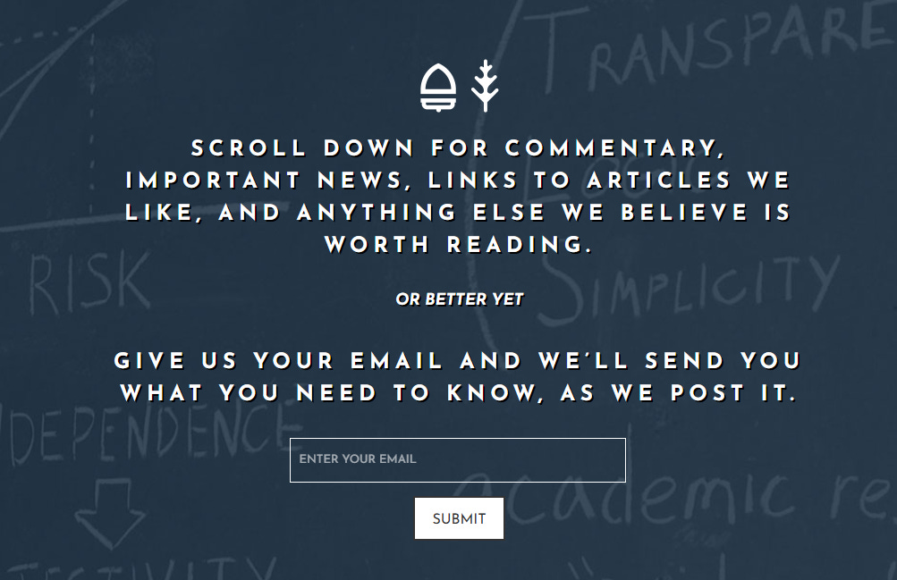
Strength + Area of Improvement: Straightforward (But Hard to Read) Hero
Personally, I’m not a fan of white text on a dark background, especially with an all-caps font. Still, a direct, no-frills hero and CTA is a refreshing sight. Well done.
Also, I signed up for email alerts — it’s framed as just that, alerts, but I expected a confirmation email or the start of a nurture sequence. Nothing yet. It could indicate they don’t have a newsletter or nurture sequence, which would be a major area of improvement.
Area to Improve: Page Organization and Presentation
The content archives sidebar is organized by date, not by topic (e.g., tax planning, social security optimization) — a missed opportunity. Readers aren’t going to take the time to click through random months to find relevant materials. Content production is consistent though (monthly).
Only the four latest posts are featured with preview text. Even so, the preview text is just the opening 150 words or so of the article — this section should instead be framed to succinctly explain what’s inside and “WIIFM” (what’s in it for me, as the reader).
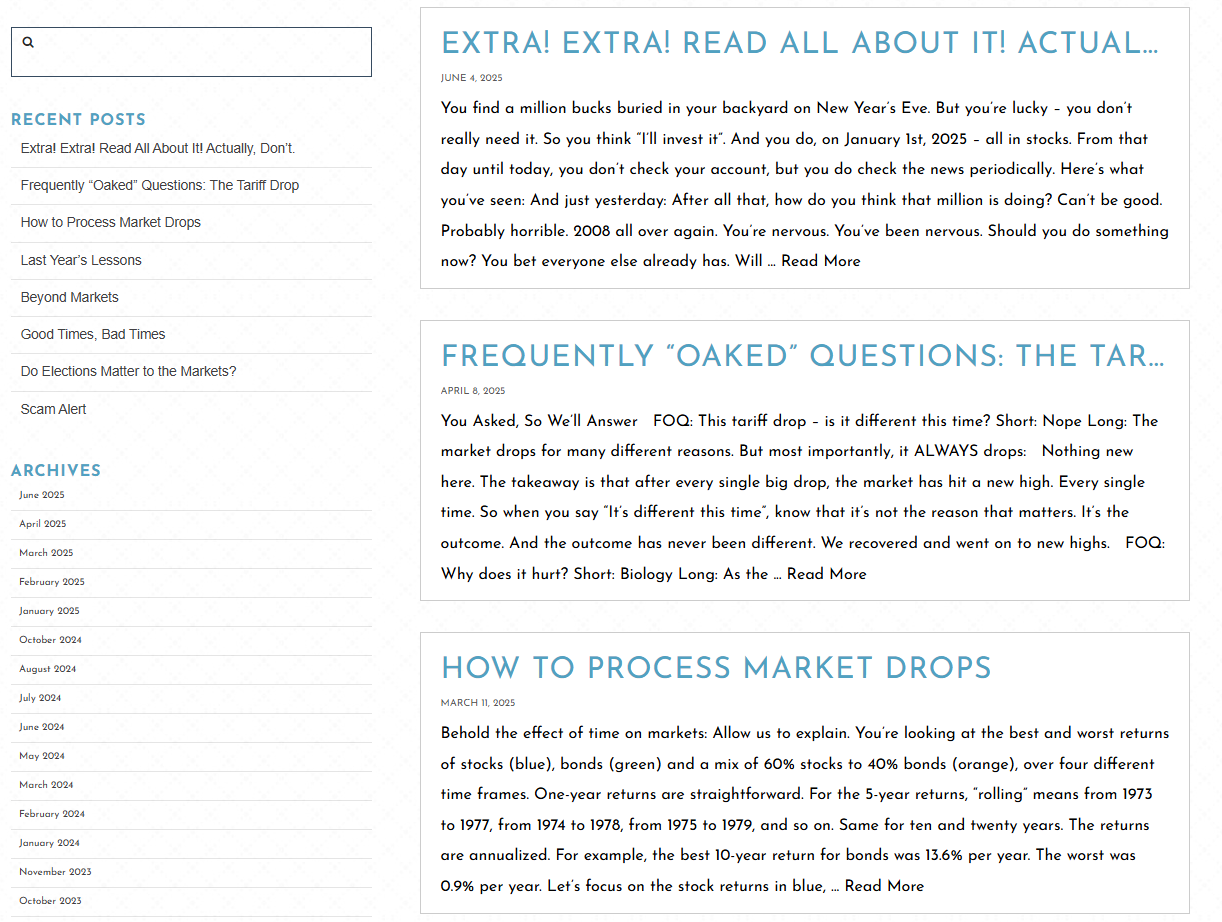
Strength: Digestible, FAQ-Style Post Example
Frequently “Oaked” Questions — another clever spin. This FAQ-style content has very digestible formatting. Straight and to the point. Likely addresses the concerns of many clients simultaneously.
Strength: Down-to-Earth, Humanized Brand Voice
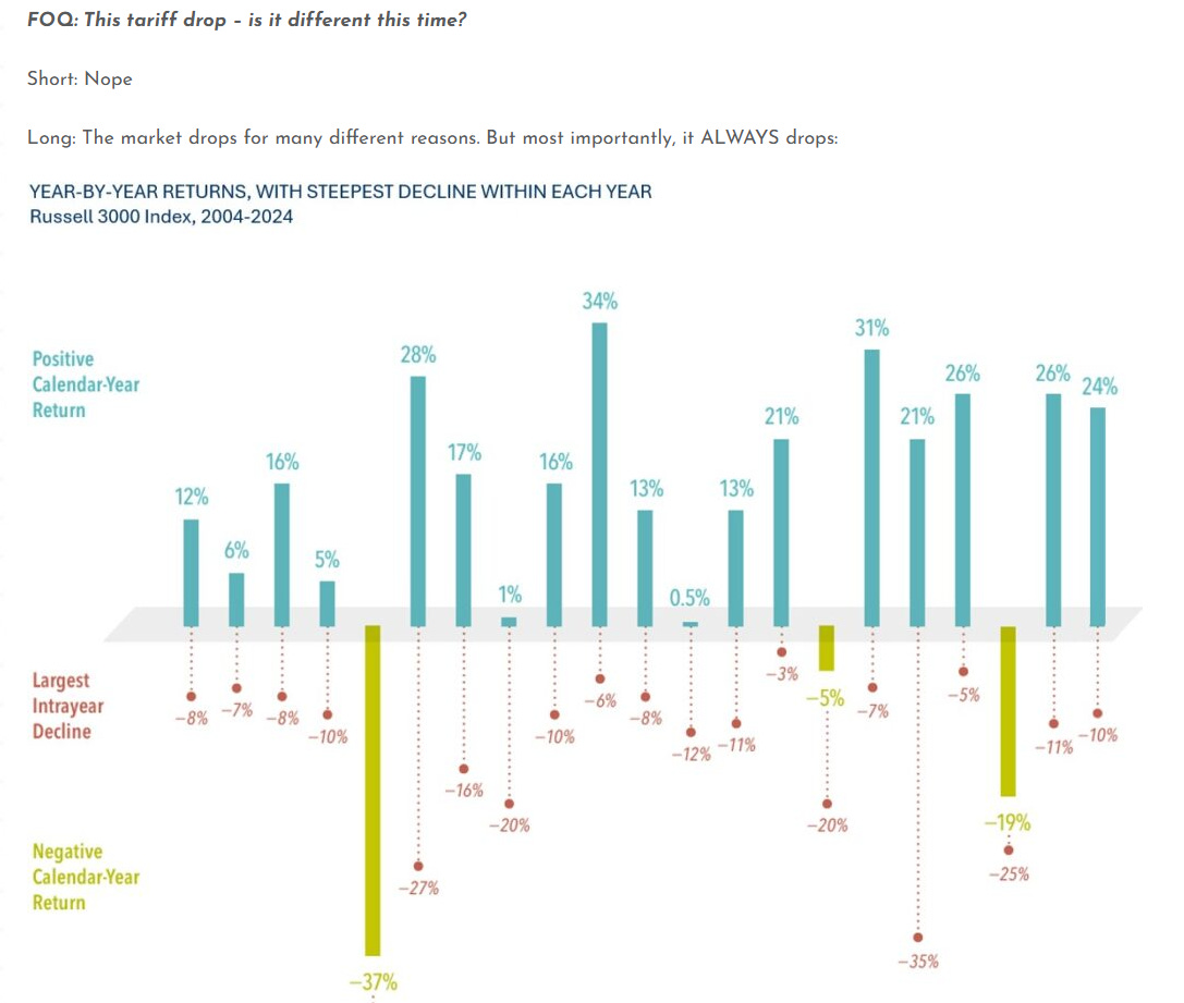
Fortuitously, for a random RIA, this is an excellent example of down-to-earth, reader-centric language. Great Oak has done a commendable job at branding themselves in this manner. Here’s a snippet from “Extra! Extra! Read All About It! Actually, Don’t.” that illustrates their brevity and humor.
Area to Improve: Missing Deeper Content
Greek Oak has a mix of content formats (e.g., personal essays, market updates, FAQs), but it seems to be missing deeper dives into specific planning areas and client pain points.
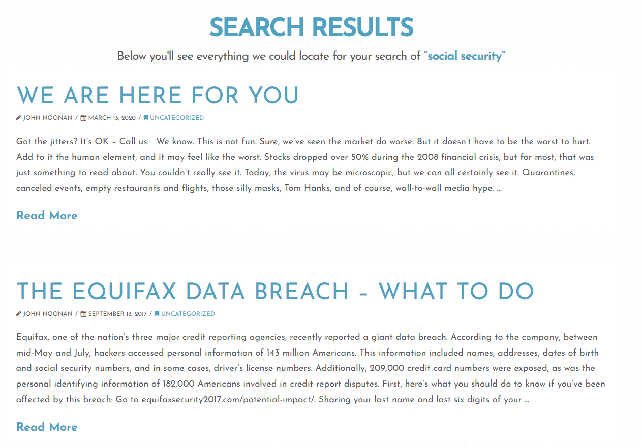
For instance, if I search “social security” or “tax planning,” no results contain these terms in the title. And after scanning through the articles that do populate, they’re only coming up because the search term happens to be briefly referenced somewhere on the page.
Takeaways
Without question, Great Oak nails authenticity and brand tone, but has some missed opportunities in terms of UX and deeper content. A few tweaks and stronger service framing could push their site to the next level.
Let’s go over a few key takeaways:
Avoid Stock Photos, When Possible
Replace stock photos with real pictures, even if it’s just shots of your team around the office. Or, you could lean into cohesive graphic designs like Great Oak.
Lean Into Personality
The "Frequently Oaked Questions" section is clever. Their writing voice is humorous and playful, while still maintaining professionalism. Find places where you can inject voice and humanize your brand.
Make Your Value Clear
While Great Oak has a relatable tone, the service explanation could be expanded. Don’t assume visitors know what you do. Add specificity around process, pricing, or results.
Create a Process or Journey Map
Never assume someone will intuitively know where to go next. Put yourself in a prospect’s shoes — open up your home page and assess whether there’s an obvious sequence through your site, like a tour guide walking you through an exhibit.
Take friction out of the equation.
Don’t Underestimate Content Strategy
Comprehensive insights help convey comprehensive expertise and services. Beyond market commentary, add educational content (like guides, FAQs, or insights) to help nurture visitors and move them through your funnel.
Know a firm you'd love to see reviewed next — maybe even your own? Hit reply and let me know.
Until next time,
—Carter
Financial Copywriter | Founder of Assets Under Marketing
P.S. Don’t forget to subscribe: